An attempt at drawing
0
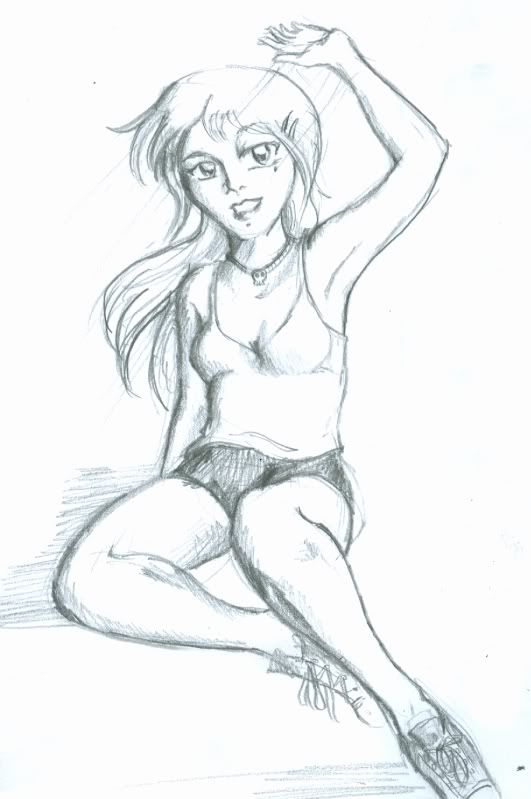
I need to learn how to draw anime faces >_< Constructive criticism and harsh (but tactful) comments are appreciated.
Yes, I am very aware her hands suck :P I had no references at the time.
Also, how does one calibrate a tablet? Maybe I can fix this bad boy on photoshop >_<
Yes, I am very aware her hands suck :P I had no references at the time.
Also, how does one calibrate a tablet? Maybe I can fix this bad boy on photoshop >_<
Spoiler:
1

since your asking for tips, the only thing that I can share to you is to make your work inaccurate. Since your used in real life sketches, the process in construction of anatomy is almost similar to the object which is not used in anime. Manga/anime are mostly constructed using the basic shapes, [rectangle, circle etc] by composing this thing, you can easily manage to shape up your character without having any real life reference. Remember that anime characters are all created using the artists imagination, pulling out all the best qualities to construct a very good character. The most style used in anime are hard edges, you can see it by checking the elbow, knees of the character. For faces, the first thing you need to work out is the nose. Just make it a little simple, replacing it by a dot will also work :] then for the eyes, just make it a little rounder ;] you have a nice anatomy balance so youll just need to adjust for abit :]
0
Stylistic omissions
Removed the definition of the chin.
Made the chin pointy.
Removed extra detail on the nose.
Shrunk the lip some.
General improvements
The head is too triangular. Ideally, you want a head that resembles an acorn. The subtle difference between the two shapes makes or breaks the facial structure.
Rounded the eyes some.
Darkened the lashes and gave them a more angular shape.
Rounded the top of the head and hair.
Things I did out of personal preference
I'm not an oval eye guy/suck at making oval eyes.
On the subject of tablet calibration, Pressure Curve Tool is awesome.
Removed the definition of the chin.
Made the chin pointy.
Removed extra detail on the nose.
Shrunk the lip some.
General improvements
The head is too triangular. Ideally, you want a head that resembles an acorn. The subtle difference between the two shapes makes or breaks the facial structure.
Rounded the eyes some.
Darkened the lashes and gave them a more angular shape.
Rounded the top of the head and hair.
Things I did out of personal preference
I'm not an oval eye guy/suck at making oval eyes.
Spoiler:

On the subject of tablet calibration, Pressure Curve Tool is awesome.
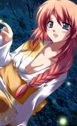
- Vanilla
- Tomboy
- Netorare
- Monster Girl
- Femdom
- Popular Tags Today: