Some GFX
0
Other than the slight spelling error on the captain commander (your-> you're), those are pretty awesome. Hah, I'm such a spelling addict.
0
Those look pretty good ^_^, but since you asked for some criticism there are a few thing's I'll comment on that you could improve on.
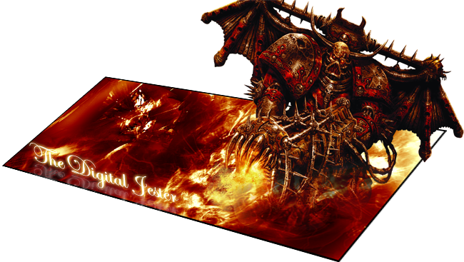
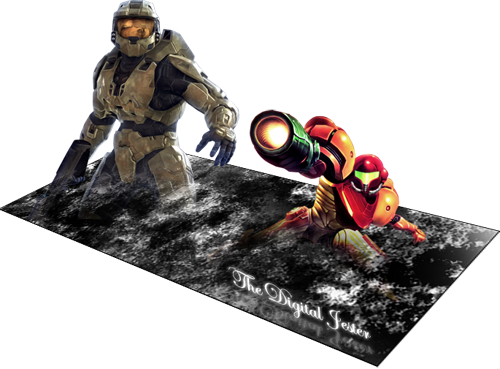
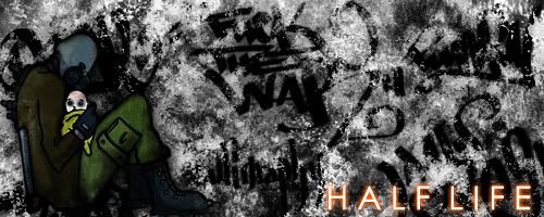
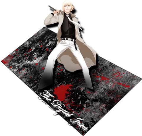
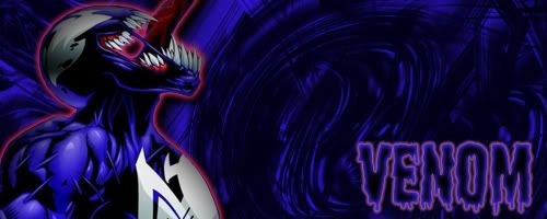
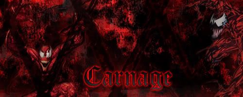
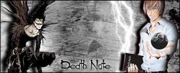
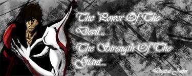
In the images where the characters are sticking out, the effect is nice, but you don't do much other than that. The first one looks great because you used some color and you blended him in with the BG well and the lighter colors around him made the demon guy the focal point of the image(it looks like fire is coming from the gun, that helped both in blending and focal point). On the other two though, it seems like all you did was make a boring background (as in almost no color or focal point), lightly erased the feet and/or legs off the chracters, and then used perspective to change the angle on the BG. Blending your stock image(the character) with the BG AND giving the image a focal point are important things to remember when you make a sig.
On the other hand, you are pretty good at text XD just try not to make it the brightest or biggest thing in a sig(unless the text is the focal point i suppose), it hurts the overall image when you have a nice background and stock image, but the viewer's eyes are drawn to the text every time.
Anyways, that's my two cents, i hope i don't sound like an ass or anything XD otherwise, great sigs, i hope to see more from you ^_^
